Using Real-time Analytics
The Real-time Analytics area of Vonage Contact Center (VCC) contains dashboards that you or other users have configured for your account. Individual Real-time Analytics dashboards contain various components — widgets — that represent past and current activity in your account. The components, or widgets, use near real-time APIs to gather data.
The following page describes using Real-time Analytics as a supervisor user. For information about using Real-time Analytics as an agent, see Viewing a Real-time Analytics dashboard as an agent.
How do I access and navigate Real-time Analytics?
For information about accessing and navigating Real-time Analytics, see Accessing and navigating Insights products.
Depending on your user type, you can now use Real-time Analytics to view, create, configure, save, share, and delete dashboards. You can add widgets to and delete widgets from dashboards, and rearrange widgets on a dashboard. For information about these tasks, see the following sections.
Read-only access
If you have read-only access to Real-time Analytics, you can perform the following tasks only:
- Search and filter existing dashboards and mark chosen dashboards as favorites.
- View existing dashboards that you have access to.
- Rearrange widgets in a dashboard. For information, see How do I rearrange widgets in a dashboard?.
How do I select and view an existing Real-time Analytics dashboard?
For information about opening dashboards, see Open an existing dashboard in Real-time Analytics, see Accessing and navigating Insights products.
Depending on your user type, you can add widgets to and delete widgets from, and rearrange widgets on the dashboard. For information about these tasks, see the following sections.
How do I create a new Real-time Analytics dashboard?
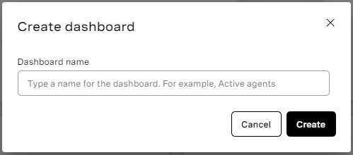
To create a new dashboard, in the Real-time Analytics area of the VCC Admin Portal, click Create dashboard. In the dialog that appears, type a name for the name dashboard and click Create.
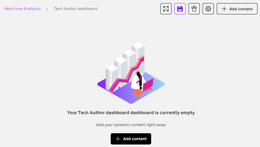
A new dashboard, empty, dashboard appears.
You can now configure default settings for, add widgets to, and save your dashboard. For information, see How do I configure default settings for a dashboard?, How do I add a widget to a dashboard?, and How do I save a dashboard?.
How do I configure default settings for a Real-time Analytics dashboard?
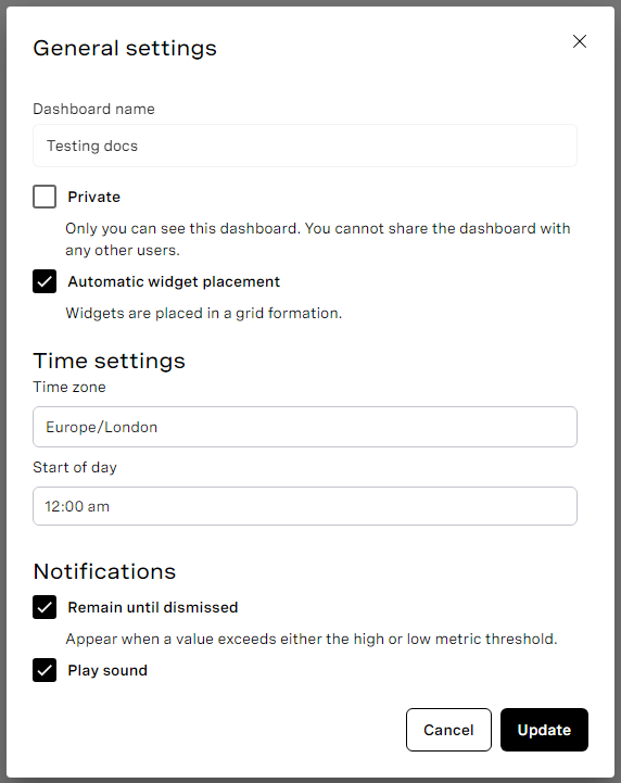
To configure default settings for an open dashboard, click the cog icon. The General settings dialog box appears.
In Dashboard name, type a name for your dashboard. Your title must be between 1 and 256 characters long can contain Unicode, other than 4-byte, characters.
If you own the dashboard, Private appears in the General settings dialog box. You can set the access to private or shared.
- Select Private to make the dashboard unavailable to other users.
- Clear Private to make the dashboard available to other users, including agents, in your account.
By default, Private is cleared meaning that the dashboard is visible to anyone with access, including agents.
Agent access
To share a dashboard with an agent, you must set access to shared. You must also send the intended agent or agents a link to the dashboard. For information about sharing dashboards, see How do I share a dashboard with an agent?.
In Automatic widget placement, select how you want to place widgets.
- Select Automatic widget placement to place widgets in a grid formation.
- Clear Automatic widget placement to be able to place widgets anywhere on the dashboard.
In time settings, you can set the time zone and start of day.
- In Time zone, select the time zone you want your dashboards to use when displaying data.
- In Start of day set the default start time for the dashboard. The start of day determines the time from which data in the dashboard is displayed. For example, if you set Start of day to 09:00 am, the dashboard displays activity in your account from 09:00 am in your selected time zone for up to 24 hours (08:59 am the next day).
In Notifications, configure how browser notifications will be sent:
- Select Remain until dismissed to make browser notifications visible until you close them.
- Clear Remain until dismissed to make browser notifications disappear after a few seconds.
- Select Play sound to play a sound along with the notifications.
- Clear Play sound to make notifications silent.
Click Update to save any changes you have made.
How do I delete a Real-time Analytics dashboard?
For information about deleting a real-time dashboard from the tile or row view, see Delete a dashboard in Accessing and navigating Insights products.
To delete a dashboard from within the dashboard, click the dashboard's delete icon (). You are prompted to confirm that you want to delete the dashboard. Click Delete to confirm or Cancel to cancel the deletion.
How do I add a widget to a dashboard?
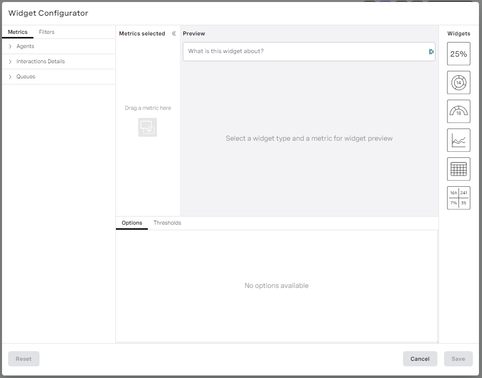
To add a widget to a new or existing dashboard, click Add content. Widget Configurator appears.
Define the settings for your widget as described in the following sections.
You can start either by choosing the metrics you want to display and then the widget to display the data in or by choosing the widget and then the metrics you want to display in the widget. We recommend that you choose the metrics first; you can optionally choose how to group the metrics too.
Selecting metrics to display in your widget
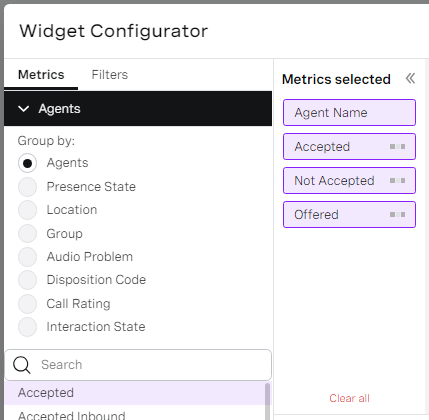
When you first click to add a new widget, the Metric area of Widget Configurator contains collapsed sections, one for each of the data types. These data types contain metrics. For information about data types, see Overview of Real-time Analytics.
To explore the different data types and their metrics, click to expand the data types — one at a time. For information about the metrics, see Real-time Analytics metrics.
When you have chosen the type of data and metrics you want to appear in your new widget, click to expand the data type. Optionally click a Group by data type option to group your chosen metrics accordingly. For information about grouping metrics, see Grouping metrics.
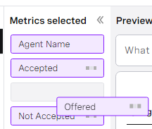
Click your chosen metric or metrics. As you click metrics, they appear — in order — in the Metrics selected area. Alternatively, drag the metric or metrics to the Metrics selected area in the required order. The first applicable Group by data type option in the list is also selected as you click a metric of that data type.
Drag the metrics in the Metrics selected area to reorder them.
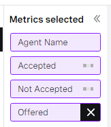
Click the cross alongside the metric in the Metrics selected area to deselect the metric.
As you select and deselect metrics, other options in Widget Configurator become available or unavailable depending on whether they are compatible with selected metrics.
You can only select metrics of one data type in a single widget.
Grouping metrics
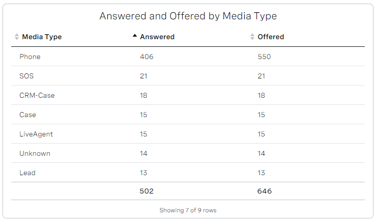
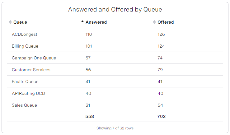
Some metrics can be grouped in different ways. For example, you can group the numbers of interactions offered to and answered in a queue (Offered and Answered metrics in the Queue data type) by Queue, Media Type, Individual Skill or Skill Combination.
You can click your chosen grouping when you first create a widget. Alternatively, selecting a metric or metrics automatically groups the metrics by the data type that contains the metric in Widget Configurator. Depending on the widget you select to display the metrics, you can see the data grouped by data type.
Answered and Offered grouped by media type
Answered and Offered grouped by queue
Filtering the data in your widget
When you have selected all the metrics you want to appear in your widget, click Filters. Depending on the metrics you have added, you will have different filters available.
| Filter | Description |
|---|---|
| Timeframe | In Timeframe, select the timeframe for the data to display. For example, if you select 1 hour, the displayed data is from the previous hour. The available and default timeframes depend on the selected metrics. If you select Today, the day starts from the time configured for Start of day in the dashboard configuration. To override the default value, click Custom and define a new value in Start of day. The custom value is for this widget only. |
| Queues | Select the queue or queues you want to display data for. For example, you may want to display metrics for interactions that have arrived in the VIP queue only. All queues in your account are available and, by default, all are selected. |
| Media Types | Select the media type or media types you want to display data for. For example, you may want to display metrics only for calls, emails, and chats. All media types in your account are available and, by default, all are selected. |
| Media Managers | Select the media manager or media managers you want to display data for. For example, you may want to display metrics only for interactions that originated in VBC and VCC and exclude those with an origin of Salesforce or SkypeForBusiness. All media managers in your account are available and, by default, all are selected. |
| Queuing Party | Select the roles of the queuing parties that you want to display data for. For example, you may want to display metrics only when the queuing party was an agent. Agent and Customer are available and, by default, both are selected. |
| Interaction Direction | Select the direction of interaction you want to display data for. For example, you may want to display metrics only for inbound interactions. All directions — Inbound, Outbound, and Internal — are available and, by default, all are selected. |
| Interaction State | Select the interaction state you want to display data for. For example, you may want to display metrics only for completed or ongoing interactions. All interaction states are available and, by default, all are selected. |
| Presence state | Select the presence states that you want to display data for. For example, you may want to display agent data only for agents in the Away presence state category, or select one of the specific states like Break or Paperwork as configured in the backend. All default and custom presences states and categories — Ready, Away, Extended Away, and Logged Out — are available and, by default, all are selected. |
| Groups | Select the group or groups you want to display data for. For example, you may want to display metrics for agents that are in the VIP group only. All groups in your account are available and, by default, all are selected. |
| Skills | Select the skill or skills you want to display data for. For example, you may want to display metrics for interactions that require the VIP skills, or for agents that are assigned the VIP skill. All skills in your account are available and, by default, all are selected. |
| Physical Locations | Select the location or locations of the agents you want to display data for. For example, you may want to display metrics for agents only in the United Kingdom. All physical locations are available and, by default, all are selected. |
| Licenses | Select the license or licenses of the agents you want to display data for. For example, you may want to display metrics for agents with supervisor licenses. All licenses are available and, by default, all are selected. |
Filtering the displayed data
When you have filtered the data that you want included in your widget, if you have chosen Groups, Skills, or both metrics to appear in your widget, you can filter specific groups, skills or both from the display.
If available, click Display Filters. Groups, Skills, or both, filters appear.
Select the Groups, Skills, or both that you want to include in the display.
Example
You have selected French and Spanish skills to display data for agents with these skills in your widget. If an agent has French, Spanish and Mandarin skills, all three skills will appear for that agent in your widget unless you hide Mandarin using display filters.
Selecting the widget to display data in
A list of widgets appears in the Widgets area of Widget Configurator. For information about widgets, see Overview of Real-time Analytics.
Click a widget to see a preview of the chosen widget with the selected metrics in the preview area.
Changing options in your widget
Depending on the widget you select, available options for the widget appear in the Options area of Widget Configurator.
| Option | Description |
|---|---|
| Group Elements Together That Are Less Than | In a Donut widget, you can group together elements that contain less than the specified percentage of interactions or agents. The grouped elements appear in a new element, Other. For example, in a Donut widget that displays calls offered to queues setting the Group Elements Together That Are Less Than to 10%, any queues that were offered fewer than 10% of the calls are grouped. Type the percentage below which you want to group elements. The default percentage is 1. |
| Legend Placement | Donut and Trend widgets can display a legend which lists the widget's metrics. Click None, Right or Bottom to display no legend or a legend on the right side or bottom of the widget. The default setting is None. |
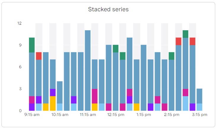
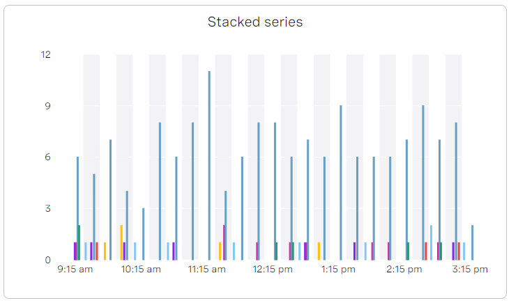
| Stacked Series | In a Trend widget, you can stack the data in an Area, Area Spline, or Bar chart. In a stacked series, the metrics' or groups' data appears on top rather than alongside or layered. Stacked Series only appears if:
The default setting is No. Click Yes to stack the data or No to leave as default. |
| Chart Type | A Trend widget can display five different types of charts: Area, Area Spline, Bar, Line, Spline. For examples of Area Spline, Line and Spline charts, see Answered and abandoned calls, Calls Offered, and Answered by media type charts in Overview of Real-time Analytics. For examples of bar charts, see Stacked series and Non-stacked series charts above. Click the chart type you want to display in your widget. The default Chart Type is Area. |
| Series | In a Trend widget, you can display each metric or each grouping as one or more data series. Click Per Metric to show an area, bar or line for each metric. The default Series is Per Metric. The maximum number of series that a Trend widget can display, is 10. |
| Show Summary Row | A List widget displays data in a table. You can choose to display a summary row at the bottom of the table. Click Yes to display the summary row. The default setting is Yes. |
| Number of Metrics per Row | In a Multi Big Number widget, you can specify how many metrics appear in each row in the widget. Click a number from 1 to 12. The default number is 3. |
| Target Time to Answer | If you select the Service Level or Answered within target metric and a Big Number, Gauge, List or Multi Big Number widget, you can specify the time that interactions must have been answered within. Inbound interactions that were answered within this time are counted as meeting their SLA. Define the time that interactions must have been answered within to count as meeting their SLA. The default setting is 20 seconds. |
| Short Abandon Time | Short abandoned calls are interactions that entered a queue and were terminated by the customer before a configured duration. Unlike standard abandoned calls, short abandoned calls typically occur when a caller accidentally enters a queue. The short queueing duration offers the agents no opportunity to serve the interaction. If you select the Abandon Rate, Abandoned, Avg Time To Abandon, Short Abandoned, or Service Level metric within Queues data type, you can specify the short abandon time. Interactions that were abandoned within this time are counted as Short Abandoned, and are not included in the selected metric. If they were abandoned after this time, they are counted as Abandoned and not Short Abandoned. |
| Significant Interactions Duration | If you select the Significant Interactions metric within Agents data type and a Big Number or Multi Big Number widget, you can specify the length of interaction that makes it 'significant'. Define the minimum time that an agent must spend handling an interaction for the interaction to be counted as significant. The default time is 30 seconds. |
| Include Agent Transfers | If you select Offered or Service Level metrics within Queues data type, you can include or exclude interactions that the agent transferred to another queue. |
Defining thresholds for your widget
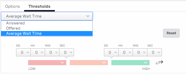
Depending on the metrics you select, you may be able to configure threshold values in the Thresholds area of Widget Configurator. For information about thresholds including notifications, see What are thresholds? in Overview of Real-time Analytics.
If you select multiple metrics for which you can define a threshold, the available metrics appear in a list. Click the metric you want to define a threshold for.
For time metrics, you must specify time thresholds; for number metrics, you must specify number thresholds; for percentage or fraction metrics, you must specify percentage thresholds.
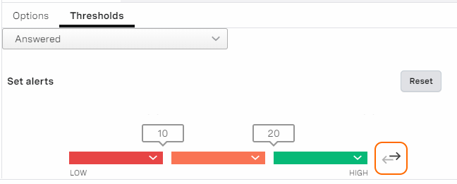
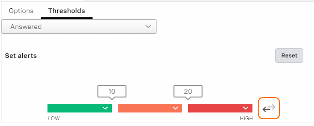
The value in the field or fields on the left must be lower than the value in the field or fields on the right. Use the arrows on the right to switch the colors if you want the highest level of alert for a low or high value accordingly. For example, you might want to set red alerts for low numbers of calls answered by agents but high numbers of breakouts.
The arrows also determine whether the ranges of values are inclusive or exclusive. Using the following examples:
Low threshold alert
The widget is red if the value of Answered is 0–10 (includes 10), amber if value is 11–20 (includes 20), and red if value is 21 or above.
High threshold alert
The widget is red if the value of Answered 0–9 (excludes 10), amber if value is 10–19 (excludes 20), and red if value is 20 or above.
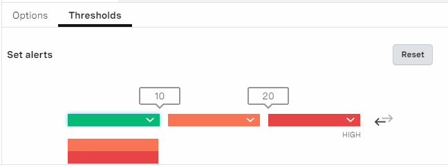
You can also change the colors of the thresholds. Click the down-arrow in the color bar and click the color you want to use.
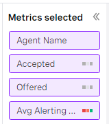
When you define a threshold for a metric, an indicator appears on the selected metric in the METRICS SELECTED area. In the following example, a threshold is defined for the Offered metric.
Configuring threshold notifications
A dashboard can send system notifications when widget values exceed the configured threshold.
You can turn on notifications at any time. To turn notifications on or off for a specific metric, select the metric and click the bell icon — or respectively — in the Thresholds area. Turning on notifications affects all users of that dashboard. When turning on notifications for the first time, you will be asked to allow system notifications in your browser. To turn them off for the whole application, block system notifications at browser level.
If you remove the threshold's color, the dashboard doesn't send a notification. Dashboards only send notifications when values cross a colored threshold.
If you block notifications in the browser, you can only turn them back on by allowing them again in the browser's settings.
Adding your widget
Provide a name for and review your widget in the Preview area of Widget Configurator. When you are happy with your settings, click Save. (Alternatively, click Cancel to discard your changes.)
Your widget appears at the bottom of your open dashboard.
How do I modify an existing widget?
To modify an existing widget, locate the widget on the appropriate dashboard. Click the cog in the widget's title bar to open the widget in the Widget Configurator dialog box. Make changes as required. For information about fields within the Widget Configurator dialog box, see Selecting metrics to display in your widget.
When you have finished making changes, click Save. Your modified widget appears on the dashboard.
How do I clone a widget on a Real-time Analytics dashboard?
To clone a widget, locate the widget on the appropriate dashboard. Click the menu icon () in the widget's title bar and, in the menu that appears, click Clone. The widget is cloned, appears at the bottom of the dashboard, and opens immediately in the Widget Configurator dialog box.
How do I delete a widget from a Real-time Analytics dashboard?
To delete a widget, locate the widget on the appropriate dashboard. Click the menu icon () in the widget's title bar and, in the menu that appears, click Delete. The widget is removed permanently from the dashboard.
How do I remove all widgets from a Real-time Analytics dashboard?
To remove all widgets from your currently displayed dashboard, click the dashboard's menu icon () and then click Clear in the menu that appears. All your widgets are removed from your dashboard. The dashboard's title and configuration settings are not changed.
How do I rearrange widgets in a Real-time Analytics dashboard?
To move widgets in a dashboard, click a widget's title bar and drag the widget to the desired location. Repeat for all widgets you want to move.
To resize widgets in a dashboard, point to the arrow icon in the lower-right corner of the widget. When the mouse pointer becomes a double-headed arrow, drag the pointer to increase or decrease the height or widget of the widget, or both.
In a List widget, you can resize and sort data in columns. Drag the column divider to resize the column, or click the column heading to sort the order of data.
How do I save a Real-time Analytics dashboard?
To save a dashboard, click the save icon (). Saved dashboards appear in the Dashboards list for all users (if published).
How do I change the access to a Real-time Analytics dashboard?
To change access to an open dashboard, click the cog icon. The General settings dialog box appears.
If you own the dashboard, Private appears in the General settings dialog box. You can set the access to private or shared. Select Private to make the dashboard unavailable to other users. Clear Private to make the dashboard available to other users in your account. Click Update to save any changes you have made.
How do I turn read-only access for agents on or off?
If enabled for your account, agents have read-only access to dashboards that have been shared with them. For information about turning this access on and off, see Dashboards - agents can use URL to access read-only Dashboards in Controlling features for your account. For information about sharing individual dashboards, see How do I share a dashboard with an agent?.
How do I share a Real-time Analytics dashboard with an agent?
When you have made a dashboard public, you can copy the URL to the dashboard and send that URL to the agent. If enabled for your account, the agent can use the URL to access the dashboard directly. The agent has read-only access. For information about viewing the shared dashboard as an agent, see Viewing a Real-time Analytics dashboard as an agent.
How do I download the content of a List widget in CSV format?
When you have a List widget in a Real-time Analytics dashboard, to download the content in CSV format, click Export in the options menu on the right side of the widget. For information about turning the download of widget data on and off, see Dashboards - users can download widget data in Controlling features for your account.
How do I download an interaction's data in CSV format?
When you have a List widget displaying interaction metrics, you can click an interaction to inspect it. In this view, a timeline of the interaction appears plus a table containing a detailed list of interaction events and applets involved in the interaction. If the feature is enabled, to download the content of the table in CSV format, click the download icon in the top-right corner of the table. For information about turning the export of interaction data on and off, see Dashboards - users can download widget data in Controlling features for your account.
How do I download an agent's summary state data in CSV format?
When you have a List widget displaying agent metrics, you can click an agent to inspect it. In this view, a timeline of the agent's summary states appears plus a table containing a detailed list of the agent's summary states throughout the timeframe of the widget. If the feature is enabled, to download the content of the table in CSV format, click the download icon in the top-right corner of the table. For information about turning the export of agent summary state data on and off, see Dashboards - users can download widget data in Controlling features for your account.
- Configuring a widget in a Real-time Analytics dashboard for queued callbacks
- Filtering Real-time Analytics data by media type and media manager
- Viewing a Real-time Analytics dashboard as an agent
- Viewing agent summary state details in a Real-time Analytics timeline
- Viewing audio problems in Real-time Analytics
- Viewing automatically rejected WebRTC interactions in Real-time Analytics
- Viewing call ratings in Real-time Analytics
- Viewing disposition codes in Real-time Analytics
- Viewing interaction details in a Real-time Analytics timeline and a table
- Viewing mapped data source data in Real-time Analytics
- Viewing service levels in Real-time Analytics
- Viewing service names in Real-time Analytics
- Viewing video interactions in Real-time Analytics
For general assistance, please contact Customer Support.
For help using this documentation, please send an email to docs_feedback@vonage.com. We're happy to hear from you. Your contribution helps everyone at Vonage! Please include the name of the page in your email.
