Using Historical Analytics
Historical Analytics dashboards are made up of individual tiles. Each tile displays chosen data in the chosen form.
Currently tiles show data about agent events, groups, interaction events or summary, skills, and users — this data is the same data that used in Dashboards and Insights Stats API. Conversation Analyzer data In Looker, data is contained in fields. Fields can be of three types: Each field has a tooltip that describes the field's content. Historical Analytics course We now have a dedicated Historical Analytics course in our Vonage Academy. For more information, see Analytics course.
Licenses
To access Historical Analytics, you need to have a Viewer or Creator license. Depending on which license you have, you can perform different tasks in Historical Analytics.
| Task | License | |
|---|---|---|
| View | Creator | |
| Access Historical Analytics | ||
| View dashboards | ||
| Filter data in dashboard | ||
| Download dashboard | ||
| Schedule delivery of dashboard | ||
| Create dashboard | ||
| Copy dashboard | ||
| Edit dashboard | ||
| Delete dashboard | ||
Accessing and navigating Historical Analytics
Only users with Viewer or Creator licenses can access Historical Analytics. For more information about licenses, see the Who can access Historical Analytics? section in Overview of Historical Analytics.
For information about accessing and navigating Historical Analytics, see Accessing and navigating Insights products.
For information about available default dashboards, see Default Historical Analytics dashboards.
Displaying Historical Analytics dashboards
To maximize the space available to display dashboards, you can:
- Use full page view (1)
- Hide dashboard filters (2)

Viewing Historical Analytics dashboards
To view available dashboards, you need to have a Viewer or Creator license. When viewing a historical dashboard, you can filter the data on the dashboard using the filters at the top of the dashboard. To explore the data in an individual tile, click the three dots in the top-right corner and then click Explore from here. For more information about viewing dashboards in Looker, see Viewing dashboards (Looker help).
Creating a new Historical Analytics dashboard
To create a new dashboard, you need a Creator license. From the Historical Analytics homepage, click Create dashboard in the top-right corner. Provide a name for your new dashboard and click Confirm. You are redirected to your newly created dashboard. By default, the dashboard is empty.
The newly created dashboard is saved in a collection of custom dashboards.
Copying existing Historical Analytics dashboards
Copying an existing dashboard creates a new custom dashboard. If you have a Creator license, you can copy default or custom dashboards.
Copying default dashboards
For information about copying dashboards, see Clone or copy a dashboard in Accessing and navigating Insights products.
After providing a name, a new dashboard containing all tiles from the original dashboard appears. You can now change all tiles. The new dashboard is a custom dashboard and will be saved along with other custom dashboards.
Editing custom Historical Analytics dashboards
If you have a Creator license, you can edit custom dashboards. To start editing a new or existing custom dashboard, click Edit Dashboard. When in edit mode, you can add new text or visualization tiles. You can also add filters and change dashboard settings. Anyone with a Creator license can perform all actions listed in the dashboard menu.

Anyone with a Viewer license can only download a dashboard, reset filters and change viewer's time zone.

Creating a new tile in a custom Historical Analytics dashboard
To add a tile to your dashboard, click Edit dashboard, either in the center of an empty dashboard, or from the menu in the top-right corner of the dashboard.
Empty dashboard

Existing dashboard

When the dashboard is in edit mode, click Add Title, either in the center of an empty dashboard or from the configuration bar in the top-left corner of the dashboard.
Empty dashboard

Existing dashboard

Choose either Visualization or Text.
Creating a text tile
Add text tile to put some static text — title, subtitle, and body — on the dashboard. This text may describe the entire dashboard or a section of it.
Creating a visualization tile
Add a visualization tile to display agent events or interaction events. Looker documentation refers to visualization tiles as query tiles. In a visualization — or query — tile, firstly choose an Explore depending on the data you want to display — either Agent Events, Groups, Interaction Events, Interaction Summary, Skills, or Users (or other type that is available to you).
Exploring data
After choosing an Explore (Agent Events, Groups, Interaction Events, Interaction Summary, Skills, or Users, or other), you can see all the available data you can work with when creating a tile. On the left, you can see a field picker containing filter-only fields, dimensions, and measures. Use the tooltip alongside each dimension and measure to see its description. For information about all the fields in each explore, see Historical Analytics fields.

To specify the data you want to appear in the tile, click required dimensions and measures. In Looker, dimensions appear as blue columns and measures appear as orange columns in the data table. Click Run to see the data.
The query shown below displays the total duration of agents' states by querying the Agent Explore and displaying one dimension (Agent Events — Event — State) and one measure (Total Duration). The data is not filtered and shows the total duration in the default unit — milliseconds.

For more information about exploring and pivoting data, see Exploring data in Looker (Looker help).
Filtering data
To filter results displayed in a data table, add dimensions or measures, or both, to the Filters section.
- To add filters, click the filter icon next to the field name.
- To change duration units used to display data, choose Duration Unit from FILTER-ONLY FIELDS.
- To narrow down your results to a specific number of results, click Row Limit in the Data section.
Click Run to apply the filters and display the results.
The following query displays results from the previous example, but with filters applied.
The data displays the total duration of agents' states excluding LoggedOut state (1), in minutes (3), from the last 3 months (2).
The data is limited to show the first 10 results (4), ordered descending by Total Duration.

For more information about filtering and limiting data, see Filtering and limiting data (Looker help).
Visualizing data
To choose the visualization type that is most suited to your needs, expand the Visualization section.
On the top bar, choose the type of the visualization. Each type has an option panel where you can configure visualization details, such as formatting values, showing labels and numbers, choosing color palettes etc.
The following query displays results in a Table. The total duration is rounded to full minutes (Format: Decimals (0)).

The following query displays results in a pie chart. Value Labels is set to Labels, with a Label Type of Label - Percent.

For more information about visualizing and option settings, see Creating visualizations and graphs (Looker help).
Saving tiles
Setting or changing default filter settings in Historical Analytics
When viewing Historical Analytics dashboards, viewers can filter dashboard data according to available filter settings. Most dashboards have filters that refine the data in all the tiles on that dashboard. Newly created dashboards do not have filters until configured. Default dashboards are configured with default filter settings.
If you have a Creator license, you can create a new dashboard or copy a default dashboard and add or change default filters to meet your requirements.
To add a new filter to or change an existing filter on a dashboard, ensure that the dashboard is in edit mode and that it contains at least one tile.
To add a filter, click Filters, and then Add Filter. Select the dimension you want to filter by.
To change an existing filter, locate the filter that you want to modify, click the three dots alongside its name, and click Edit.
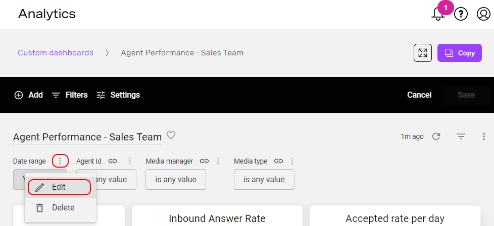
To set the default filter value, change the value under Configure Default Value field.
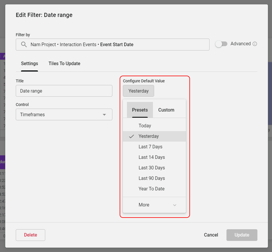
You can also change the filter's title and its type. To change the filter's type, click Control. The options available depend on the type of data you are filtering. In the example above, viewers can use date-related controls in the Data range filter to refine the data.
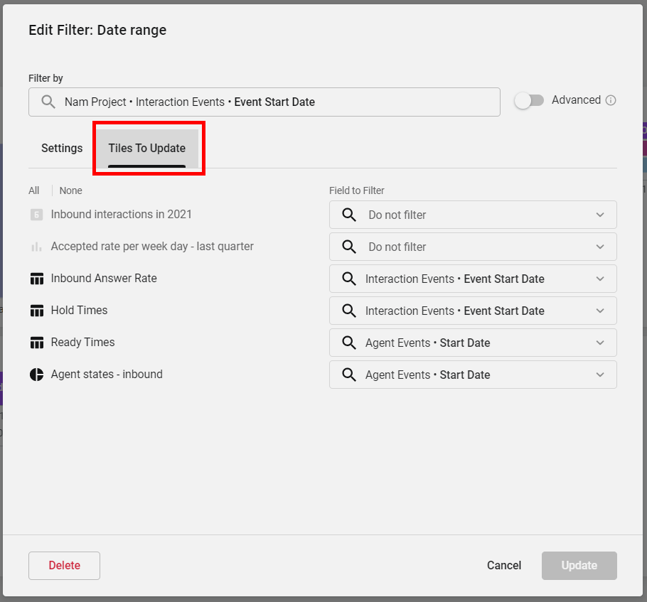
When adding a new filter, specify tiles that are updated by the filter. To specify tiles, click Tiles To Update. On the list of tiles, select the ones you want to be updated by the filter and select the field you want to filter using the filter value. If you don't want to apply the filter to specific tiles, select Do not filter.
When you have finished making changes, click Add or Update. As a final step, to save the whole dashboard, click Save in the top right corner.
Changing default time zone in Historical Analytics
All default dashboards display data by default in the viewer's time zone according to their browser’s configuration.
If you have a Creator license, you can create a new dashboard or copy a default dashboard, and change the default time zone.
To change the default time zone for a dashboard, ensure that the dashboard is in edit mode.
Click Settings. Settings appears. In Timezone, select the new default time zone.

When you have finished making changes, click Save. As a final step, to save the whole dashboard, click Save in the top right corner.
Now all data in the tiles in the dashboard will be displayed in the selected time zone unless the viewer chooses a different time zone.
Scheduling delivery of a Historical Analytics dashboard
If a user does not have access to Historical Analytics, but you have a Creator or Viewer license, you can send the user an email containing a copy of a dashboard. You can send the email to an individual user or to a group recipients either immediately or on a repeat basis. To send a dashboard, you must be viewing the dashboard (not in edit mode). Go to Dashboard actions and click Schedule delivery.

On the Settings tab, you can specify recurrence and time of delivery, list recipients' emails (comma separated), and choose the format to send the dashboard in.
The Filters tab allows you to narrow the results to include the most relevant data for specified recipients.
On the Advanced options tab you can configure the look of sent dashboard. (If you select PDF format on the Settings tab, we recommend that you select all three checkboxes to use most efficient PDF capabilities).
The following example shows the Weekly - Billing Gold - TeamLead schedule.
The dashboard will sent weekly, on Mondays at 9:00 AM (America - Los Angeles time zone).
Data will be filtered to include the last 30 days for the Monthly Queue Results tile, and the last 7 days for the Weekly Queue Results and Queue Outcomes tiles.
The dashboard will include only one queue — UCD Billing Gold Queue.
The dashboard will be sent in PDF format.


To edit, duplicate or delete schedule, click the three dots icon next to schedule name in Schedules window. To send the report immediately, click Send now button.
For more information about visualizing and option settings, see Scheduling and sending dashboards (Looker help).
Downloading data from Historical Analytics dashboards
Anyone who can access Historical Analytics can download dashboard data. To download data, the dashboard must be in view — not edit — mode. You can download either the whole dashboard or an individual tile.
Downloading a whole dashboard
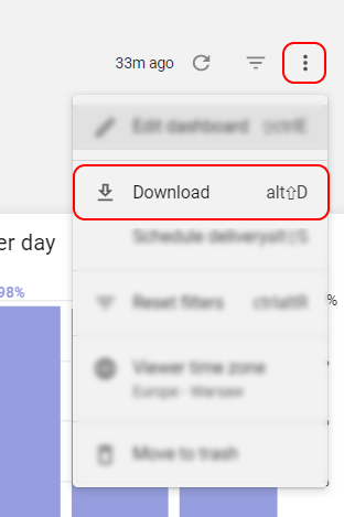
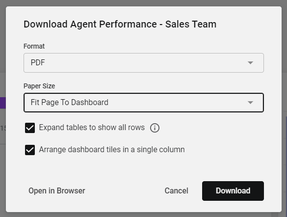
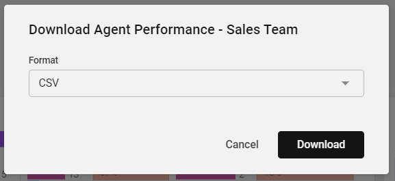
To download a whole dashboard, go to Dashboard actions and click Download.
When downloading the whole dashboard, you can choose from the following formats:
- PDF. The dashboard is saved in a PDF file and looks the same as when viewing the dashboard in Historical Analytics. We recommend that you click to select both of the Expand tables to show all rows and Arrange dashboard tiles in a single column check boxes to include the whole data set and to show the data more clearly.
CSV. The dashboard's data is downloaded in a ZIP (.zip) file containing multiple CSV (.csv) files. Each CSV file represents a tile on the dashboard.
If you download the whole dashboard in CSV format, the downloaded data will be limited to the number of rows configured in the tile to a maximum of 5000 rows. To download more data, you need to download a single tile. For more details, see the Downloading an individual tile section later in this page.
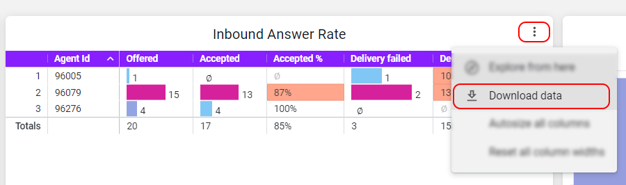
Downloading an individual tile
To download a specific tile, click the three dots alongside its name and click Download data.
You can choose from multiple formats to download data, including TXT, CSV, Excel Spreadsheet, and PNG.
When you have selected the appropriate format, click Advanced data options (not available for PNG). Configure the settings for the data such as the order of data, the format of data values, and the number of rows and columns to include.
Number of rows and columns to include
We recommend that you always set Number of rows and columns to include to All results.
The All results option won't be available if you are using table calculations within the tile. You can either remove calculated fields or select the Custom option and specify the maximum number (100,000) of rows.
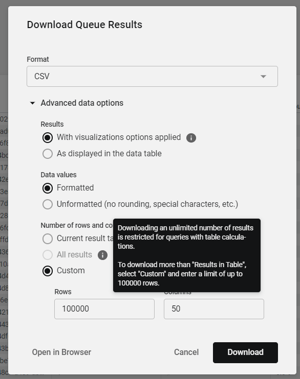
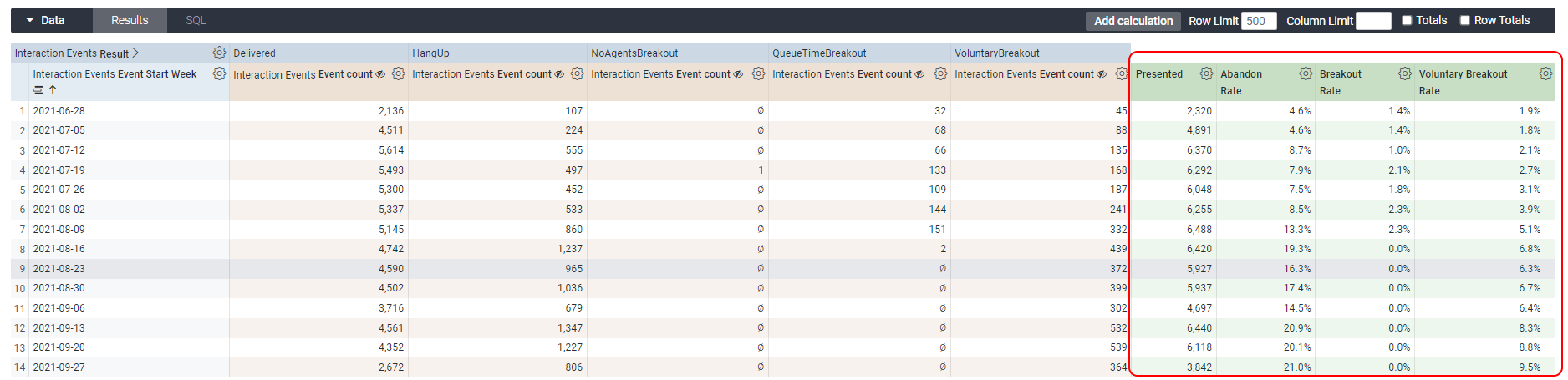
Table calculations are represented in green under the Data section.
Deleting custom Historical Analytics dashboards
To delete a custom dashboard, you need a Creator license.
You can delete a dashboard in two ways:
- From the tab with all dashboards displayed. Find the dashboard you want to delete. Click the three dots in the bottom-right corner of this dashboard. Click Delete. In the dialog that appears, click Delete. Alternatively click Cancel to cancel deleting the dashboard.

- From an open dashboard. Open the dashboard you want to delete. In the top-right corner of the dashboard, click the three dots to open the dashboard menu. Click Move to trash. In the dialog that appears, click Move to trash. Alternatively click Cancel to cancel deleting the dashboard.

For more information about managing custom dashboards, see Editing dashboards (Looker help).
For general assistance, please contact Customer Support.
For help using this documentation, please send an email to docs_feedback@vonage.com. We're happy to hear from you. Your contribution helps everyone at Vonage! Please include the name of the page in your email.